Jake Mammen, MS

Currently a Director/Operations Manager at a private emergency management company, leveraging geospatial intelligence and data-driven decision-making in high-stakes environments. Holder of a BS in Geography and MS in Geospatial Technology from the University of Oklahoma. Passionate about operations, data science, and GIS; aspiring to grow professionally at the intersection of these fields through innovative projects and analysis.
This portfolio features a curated selection of my research, academic projects, and applied experiences from my time in academia and early career, demonstrating core competencies in geospatial analysis, data science, and GIS applications. It highlights key geospatial and data science skills through interactive maps/dashboards, spatial/statistical analysis workflows, Python/R scripting for data processing and visualization and advanced GIS modeling—demonstrating practical applications of tools like Python, R, ArcGIS, QGIS, GDAL, PostGIS, and machine learning techniques for real-world geospatial challenges.
View My LinkedIn Profile
Working with Spatial Data in R
Description: In spatial statistics, you want to always explore the data you’re working with as a go-to first step. It’s considered good pratice to plot and visualize the data before fitting any statistical models.
- What is the distribution of the data?
- Are there any outliers?
- etc.
Coding examples:
In R I used the ‘GISTools’ package which contains a number of utilities for handling and visualising geographical data of a “Spatial” or “sf” object - for example choropleth mapping with ‘nice’ legends. The data being used is a polygon data frame containing social and economic data by county in Georiga.
Import proper R packages and call the dataset:
library("GISTools")
data(georgia)
plot(georgia)
Create layers to visualize Urban, Suburban and Rural Counties in Georgia:
In this use case, I explored the variable “PctRural” which gives the percentage of each county’s residents as rural. Then created layers to classify the percentage of the county’s residents by Urban, Suburban, and Rural.
- Urban (no more than 10% rural)
- Suburban (between 10% and 70% rural)
- Rural (at least 70% rural)
# Create new layer for urban counties
urban_counties <- georgia[georgia$PctRural <= 10,]
plot(urban_counties)

# Create new layer for suburban counties
suburban_counties <- georgia[georgia$PctRural > 10 & georgia$PctRural < 70,]
plot(suburban_counties)

# Create new layer for rural counties
rural_counties <- georgia[georgia$PctRural >= 70,]
plot(rural_counties)
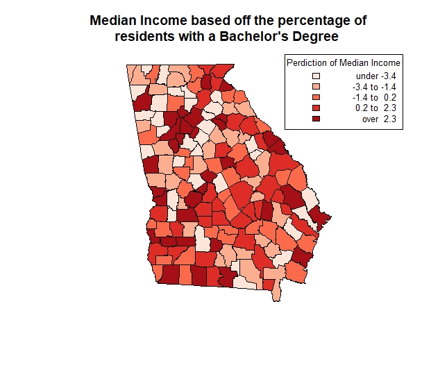
Plot Map:
Took the layers I created and created a three-color choropleth map that differentiates the three classifications without using the coropleth function in R.
# Plot Georgia
plot(georgia)
# Plot the new layers with the addition of "add=T" to overlay layers
plot(urban_counties, add=T, col="orangered3")
plot(suburban_counties, add=T, col="orange")
plot(rural_counties, add=T, col="lightgoldenrod1")
title("Percentage of the county's residents classified
      as Urban, Suburban, & Rural in Georgia     ")
legend("topright", legend=c("Urban Counties", "Suburban Counties", "Rural Counties"),
       fill=c("orangered3", "orange", "lightgoldenrod1", border = "black"))
Scenario:
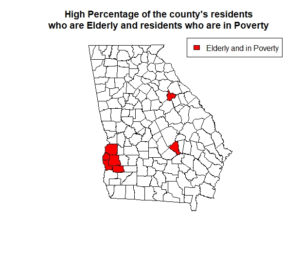
A social organization wishes to identify counties that have both a high percentage of elderly residents (i.e., PctEld > 15) and a high percentage of residents in poverty (i.e., PctPov > 30). Created a map to show the counties with residents who have hight elderly and in poverty population in red and all other counties in white.
eldpov <- georgia[georgia$PctEld > 15 & georgia$PctPov > 30,]
plot(eldpov)

plot(georgia)
plot(eldpov, add=T, col="red")
title("High Percentage of the county's residents
      who are Elderly and residents who are in Poverty       ")
legend("topright", legend=c("Elderly and in Poverty"),
       fill=c("red", border = "black"))
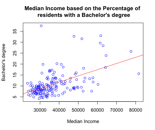
Predict median income based on the percentage of residents with a Bachelor’s degree:
Fit a linear regression model.
- First create a basic scatterplot to visualize median income and those who have a bachelor’s degree.
- Then firt a linear regression line.
- Run correlation test to see how strong the relationship between the two variables are (cor. 0.522771), which shows a moderate strenth relationship. As one variable increases the other tends to increase as well.
- The output of the below linear regression model is highly statistically significant (p-value of 1.566e-12) and explains approximately 27.33% of the variance in the dependent variable. (R^2 value is 0.2733)
plot (georgia$MedInc,georgia$PctBach,
col = "blue",
main = "Median Income based on the Percentage of
residents with a Bachelor's degree ",
xlab = "Median Income",
ylab = "Bachelor's degree")
abline(lm(georgia$PctBach ~ georgia$MedInc),col="red")
cor.test(georgia$PctBach,georgia$MedInc)
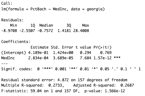
Georgiareg <- lm (PctBach ~ MedInc, data = georgia)
Georgiareg
summary (Georgiareg)
resid(lm(georgia$PctBach ~ georgia$MedInc))
Georgiareg$residuals
shades <- auto.shading(Georgiareg$residuals, cols=brewer.pal(5, "Reds"))
choropleth(georgia, Georgiareg$residuals, shading = shades)
title("Median Income based off the percentage of
residents with a Bachelor's Degree ")
choro.legend("topright", sh = shades, fmt="%4.1f",cex=0.8,title='Perdiction of Median Income')