








Working with Spatial Data in R
Description: In spatial statistics, you want to always explore the data you’re working with as a go-to first step. It’s considered good pratice to plot and visualize the data before fitting any statistical models.
- What is the distribution of the data?
- Are there any outliers?
- etc.
Coding examples:
In R I used the ‘GISTools’ package which contains a number of utilities for handling and visualising geographical data of a “Spatial” or “sf” object - for example choropleth mapping with ‘nice’ legends. The data being used is a polygon data frame containing social and economic data by county in Georiga.
Import proper R packages and call the dataset:
library("GISTools")
data(georgia)
plot(georgia)
Create layers to visualize Urban, Suburban and Rural Counties in Georgia:
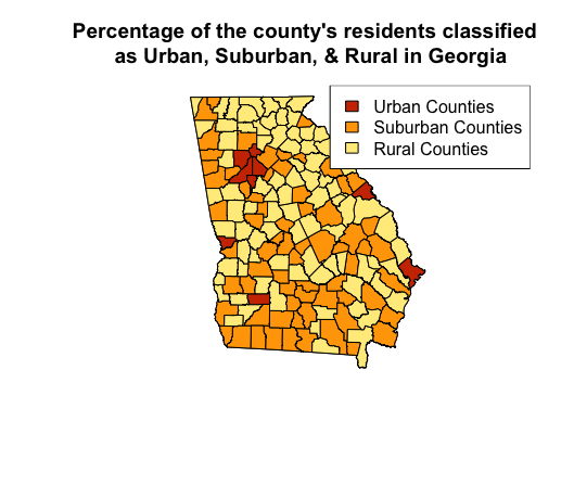
In this use case, I explored the variable “PctRural” which gives the percentage of each county’s residents as rural. Then created layers to classify the percentage of the county’s residents by Urban, Suburban, and Rural.
- Urban (no more than 10% rural)
- Suburban (between 10% and 70% rural)
- Rural (at least 70% rural)
# Create new layer for urban counties
urban_counties <- georgia[georgia$PctRural <= 10,]
plot(urban_counties)

# Create new layer for suburban counties
suburban_counties <- georgia[georgia$PctRural > 10 & georgia$PctRural < 70,]
plot(suburban_counties)

# Create new layer for rural counties
rural_counties <- georgia[georgia$PctRural >= 70,]
plot(rural_counties)
Plot Map:
Took the layers I created and created a three-color choropleth map that differentiates the three classifications without using the coropleth function in R.
# Plot Georgia
plot(georgia)
# Plot the new layers with the addition of "add=T" to overlay layers
plot(urban_counties, add=T, col="orangered3")
plot(suburban_counties, add=T, col="orange")
plot(rural_counties, add=T, col="lightgoldenrod1")
title("Percentage of the county's residents classified
      as Urban, Suburban, & Rural in Georgia     ")
legend("topright", legend=c("Urban Counties", "Suburban Counties", "Rural Counties"),
       fill=c("orangered3", "orange", "lightgoldenrod1", border = "black"))
Scenario:
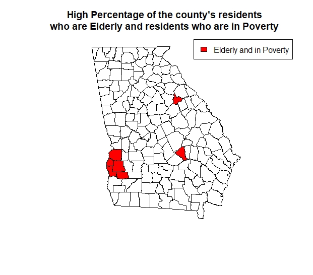
A social organization wishes to identify counties that have both a high percentage of elderly residents (i.e., PctEld > 15) and a high percentage of residents in poverty (i.e., PctPov > 30). Created a map to show the counties with residents who have hight elderly and in poverty population in red and all other counties in white.
eldpov <- georgia[georgia$PctEld > 15 & georgia$PctPov > 30,]
plot(eldpov)

plot(georgia)
plot(eldpov, add=T, col="red")
title("High Percentage of the county's residents
      who are Elderly and residents who are in Poverty       ")
legend("topright", legend=c("Elderly and in Poverty"),
       fill=c("red", border = "black"))
Predict median income based on the percentage of residents with a Bachelor’s degree:
Fit a linear regression model.
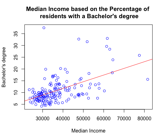
- First create a basic scatterplot to visualize median income and those who have a bachelor’s degree.
- Then firt a linear regression line.
- Run correlation test to see how strong the relationship between the two variables are (cor. 0.522771), which shows a moderate strenth relationship. As one variable increases the other tends to increase as well.
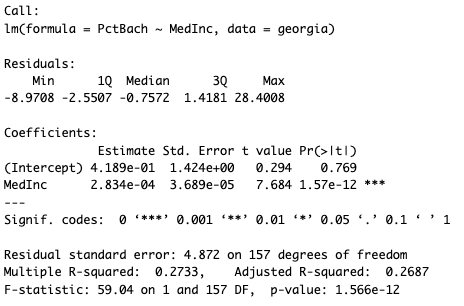
- The output of the below linear regression model is highly statistically significant (p-value of 1.566e-12) and explains approximately 27.33% of the variance in the dependent variable. (R^2 value is 0.2733)
plot (georgia$MedInc,georgia$PctBach,
      col = "blue",
      main = "Median Income based on the Percentage of
      residents with a Bachelor's degree     ",
      xlab = "Median Income",
      ylab = "Bachelor's degree")


abline(lm(georgia$PctBach ~ georgia$MedInc),col="red")

cor.test(georgia$PctBach,georgia$MedInc)

Georgiareg <- lm (PctBach ~ MedInc, data = georgia)
Georgiareg
summary (Georgiareg)

resid(lm(georgia$PctBach ~ georgia$MedInc))

Georgiareg$residuals

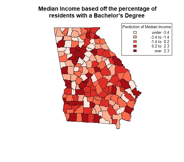
shades <- auto.shading(Georgiareg$residuals, cols=brewer.pal(5, "Reds"))
choropleth(georgia, Georgiareg$residuals, shading = shades)
title("Median Income based off the percentage of
      residents with a Bachelor's Degree       ")
choro.legend("topright", sh = shades, fmt="%4.1f",cex=0.8,title='Perdiction of Median Income')